Branding Guidelines Design
Branding Designed for OASISOPEN
Brand Guidelines Designed for OASISOPEN. Below is a concise overview of the key components in the designed brand guideline.
- Logo Design
- Color Palette
- Typography
- Icons & Graphics Elements
- Photoghraphy
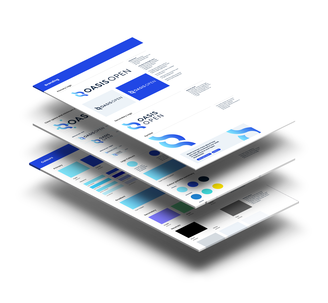
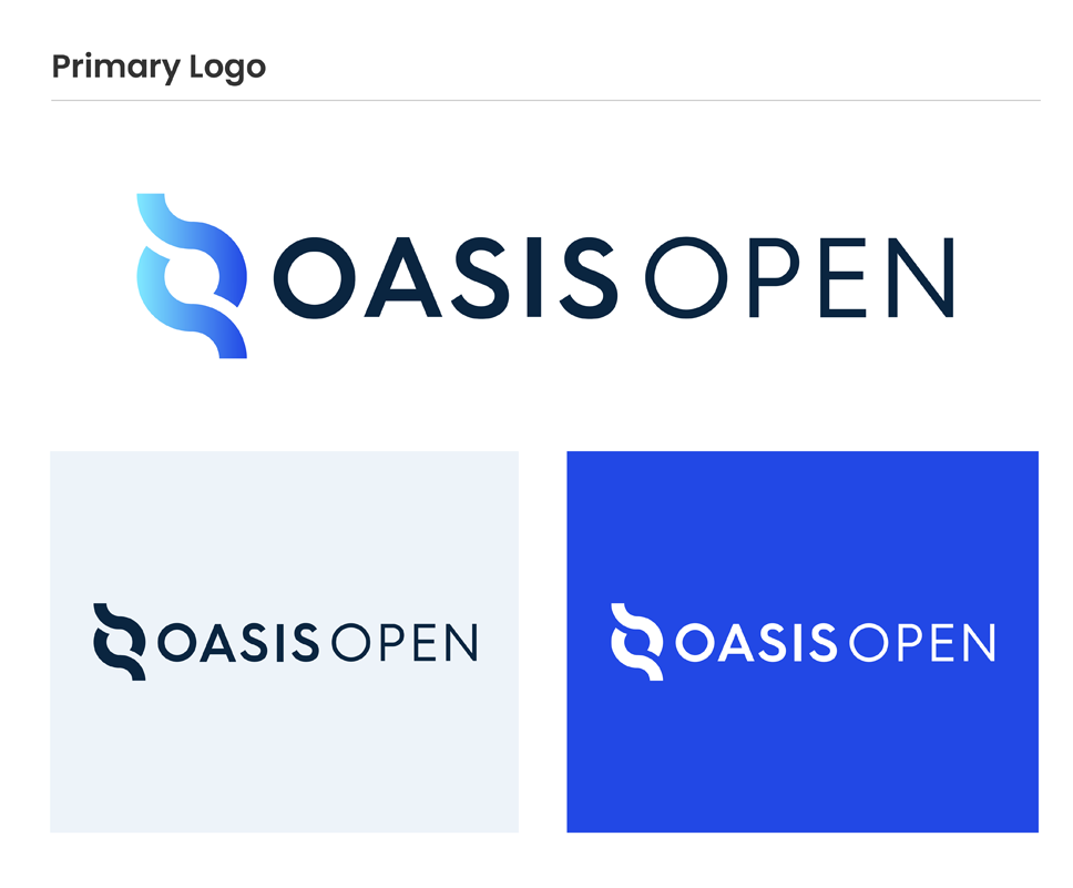
Primary Logo
The primary logo is a full-color horizontal logo and should be used wherever possible on full-color applications.
The single-color logo is available in two versions.
OASIS Mono Blue should be used on light backgrounds.
OASIS Mono White should be used on dark backgrounds.
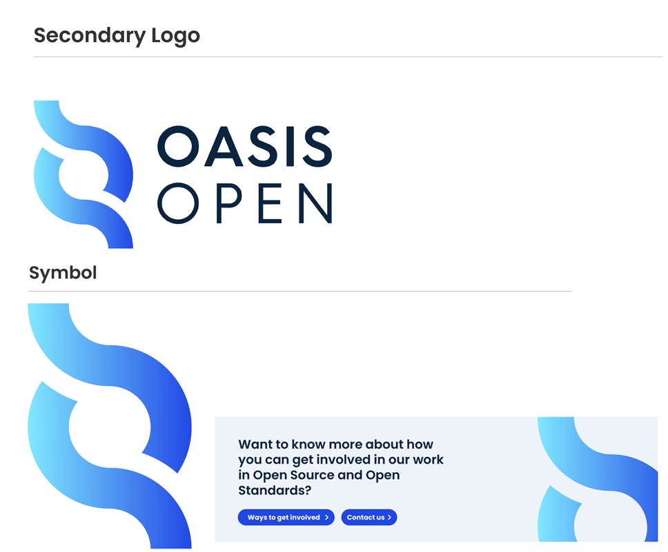
Secondary Logo & Symbol
The "stacked" version of the logo can be used in some applications where horizontal space is at a premium, for example, some printed merchandise such as mugs.
The OASIS symbol can in some cases be used in isolation, for example as an abstract background element as shown in this example.
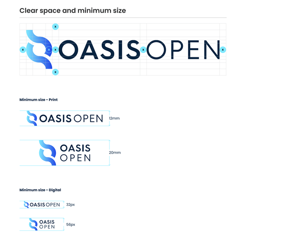
Spacing and Sizing
The logo should always be surrounded by a minimum amount of clear space that remains free from type and graphic elements to maximize standout and clarity. The clear space should be equal to the depth of the symbol, as shown by (X) here.
The minimum sizes of the logo are also shown.
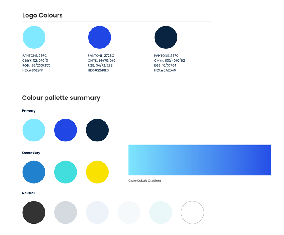
Logo Colours
We only ever use the primary color palette for the OASIS logo.
Here are the CMYK, RGB, Pantone, and HEX references.
The cyan-cobalt gradient is used for the symbol only.
The OASIS color pallette is vibrant, modern, and fresh.
Typography
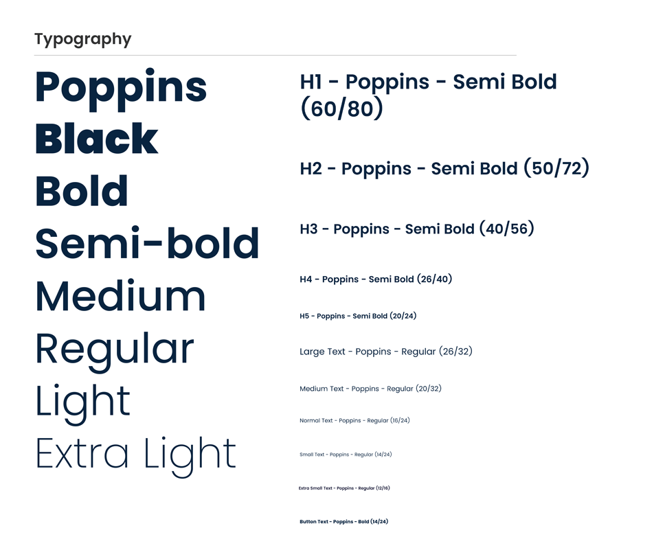
Poppins is our primary typeface and is used for all communications in both print and digital.
Only sizes outlined here should be used, and you should try not to vary sizes too much in any one screen to keep new designs looking clean and consistent.
Icons and Graphic Elements
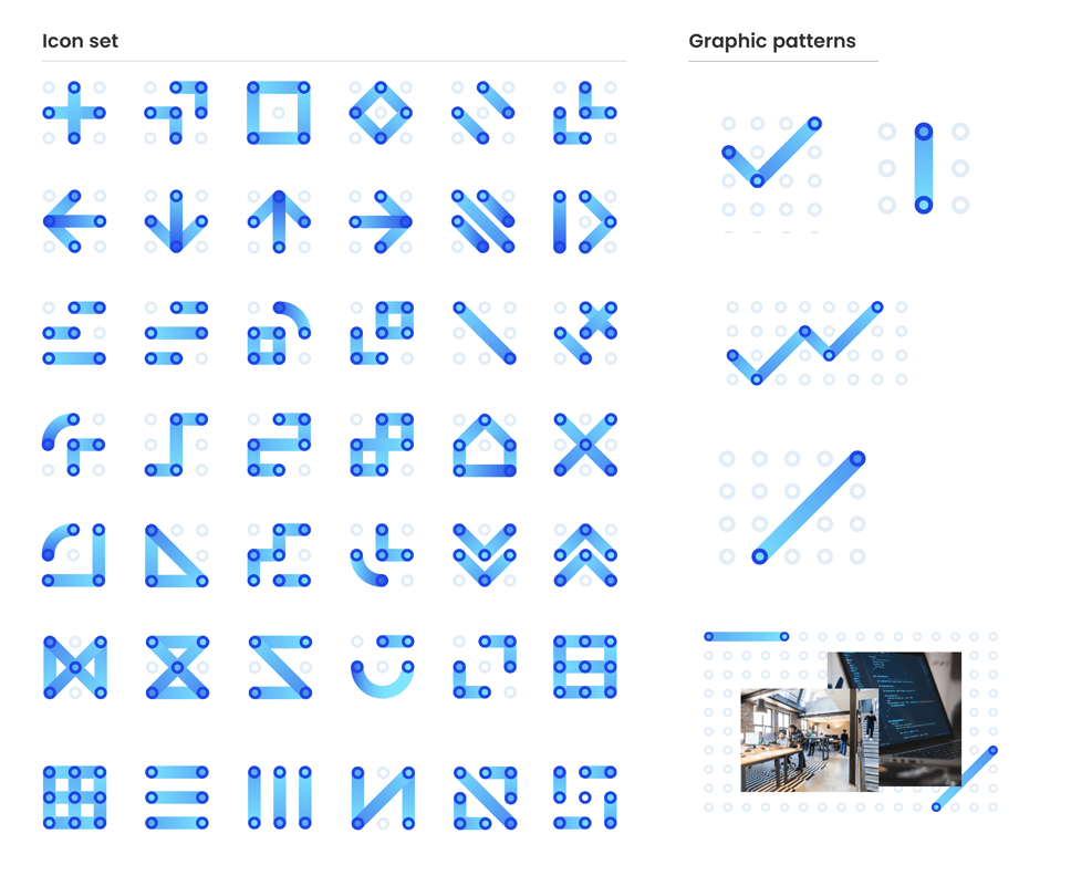
Our brand language includes patterns, shapes, and iconography that help to add more personality, and visual interest to our communications. These could even be animated in the future.
These elements are derived from the “O” in the OASIS wordmark and can be used to reinforce the, concepts of community, collaboration, networks, sharing information and being open.
Photography Style
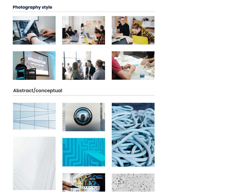
Photography is a principal brand asset. It captures the essence of the OASIS brand and shows that we are a people-first, approachable, collaborative and inclusive organization.
All images used should be light, and bright and fit with the overarching website and brand look and feel.
Our Working Process
Explore our branding process to see the pathway we take to drive growth for brands of all sizes.
01
Brand Discovery
The brand discovery stage is where we learn about your brand's ins and outs. Once we understand you, your audience, and your needs, we help you find your ideal market position to create your own space for your brand.
In this phase, we work with you to:
- Define your target audience
- Articulate your brand’s mission
- Identify your project goals
02
Brand Strategy
In this stage, our brand strategy experts deliver a comprehensive strategic framework to grow your brand across channels. This actionable roadmap helps us outline the path to measurable results for your project.
In this phase, we work with you to:
- Set KPIs
- Identify brand opportunities
- Create impactful messaging
03
Brand Logo & Visual Identity
Once you meet with our brand strategists and brand designers regarding your visual identity, they get to work. Our logo design process includes brainstorming, sketching and creating multiple logo concepts, along with supporting visual identity elements for both online and offline channels.
In this phase, we work with you to:
- Present logo designs
- Define and shape the visual elements of your brand
- Create memorable branding elements that connect with your audience
04
Brand Book & Style Guide
A brand book and style guide houses all of your essential brand information in one place, providing accessibility to employees and stakeholders alike. Beyond your logo, this includes supporting brand elements such as typography, primary and secondary color palettes, imagery selection, and iconography.
In this phase, we work with you to:
- Build a go-to guide for your brand
- Define proper and improper usage of your brand elements
- Identify guidelines to create consistency across channels
Full-Service Branding Agency
Work with a top-rated branding agency to boost brand awareness, create consistency across channels and reach your audience through results-driven strategies and solutions.